Wiley Reader.
Project Info
Company: Wiley
Industry: Education/Publishing
Role: Primary UX Designer. Conceptualized designs, conducted testing & prototyped
Duration: August 2021 - July 2022
Background
Prior to my joining of its UX Design team in August 2021, Wiley, an organization which publishes content in the areas of scientific research, higher education, and professional learning, hosted its digital textbooks on a third party reader application called Vitalsource. My first project when I did join? Designing Wiley’s first-ever in-house reader application in its 215-year history.
One of the reasons for moving to an in-house reader application included the fact that Wiley’s main competitors all had their own robust reader applications. However, the central driver behind this decision was Wiley’s convergence initiative, a company-wide effort to use a centralized design system and apply a refreshed brand to a vast array of Wiley products. Throughout the years, Wiley had created and acquired an enormous hodgepodge of digital educational products from CPA test prep to algorithmic question mastery, but had failed to give those products the same look and feel. Starting with the Wiley Reader, these products needed to be recognized as being trustworthy, beautiful, historic— all things Wiley.
Information Gathering.
Challenges
One of the main challenges working on Wiley Reader was that development for it started three months prior to my joining of Wiley and the Reader team. A lot of design “catch up” had to be made and the bulk of research had to be completed during beta testing in the later stages of the product. Testing of the live product was also emphasized.
Competitive Audit
Though we had to move quickly, we still needed to familiarize ourselves with other reading applications, especially those of our direct competitors. We had a list of features that we knew we needed to include in Wiley Reader in order to attain feature parity, but we wanted to get a better understanding of what choices our competitors had made to construct those features and if there were any standards we should consider. Once that understanding was made, we would have a baseline for designing our reader application features and figuring out what we could do better than our competitors.
Ideation.
Process
Throughout the project, my partner and I carried out the following processes regularly with each other and the Reader team to ensure frequent collaboration, timeliness, and high quality solutions:
Received feature requests from our product manager and agreed on UX requirements/deadlines
“Divided and conquered” design work and independently mapped out feature flows, sketched wireframes, and designed mock-ups in Figma to present in product meetings
Mind melded multiple times each week on work on which we each made progress— and when we both weren’t sure of something, we always sought feedback from other UX team members during our weekly UX meeting
Demoed final explorations of feature requests to our development team
Tools
Microsoft Teams for daily collaboration
FigJam for whiteboarding sessions
Confluence for feature requirements
Jira for more adhoc requests and as a forum of communication with our developers
Usability Testing.
Once we got to a point where we had solid, high-fidelity designs for most required features, we conducted a usability test with the help of Openfield, a UX design & research consulting group that was unfortunately cut from our budget halfway through the term of the Wiley Reader project. This test helped helped us validate our in-progress designs and pinpoint where we needed to make refinements.
Goals and Objectives
The aim of this research project was to determine the usability of the Wiley Reader in the following feature areas:
Progress Bar
Table of Contents (TOC)
Notes & Highlights
Bookmarks
Glossary
Readability Panel
Methodology
30 minute sessions were held with five individual participants. During each session, participants were given various tasks to complete in a prototype of the Wiley Reader.
Results
Feature
Result
Notes
Progress Bar
Failure
None of the participants noticed this feature without it being pointed out to them. Participants did not have a strong reaction to the progress bar feature
Table of Contents (TOC)
Success
All participants were able to use the Table of Contents throughout the session without friction.
Notes & Highlights
Partial Success
-4/5 participants successfully highlighted a piece of content
-5/5 participants successfully made a note on a piece of content
-4/5 participants successfully found past highlights and notes
Bookmarks
Partial Success
5/5 participants successfully bookmarked a page. All participants successfully found their bookmarked pages, but two participants looked in other locations before finding the bookmark list
Glossary
Success
All participants successfully understood the treatment of Glossary terms and were able to navigate to the Glossary of the textbook
Readability Panel
Success
All participants were able to locate the Readability Panel and understand all of the available options
Solution.
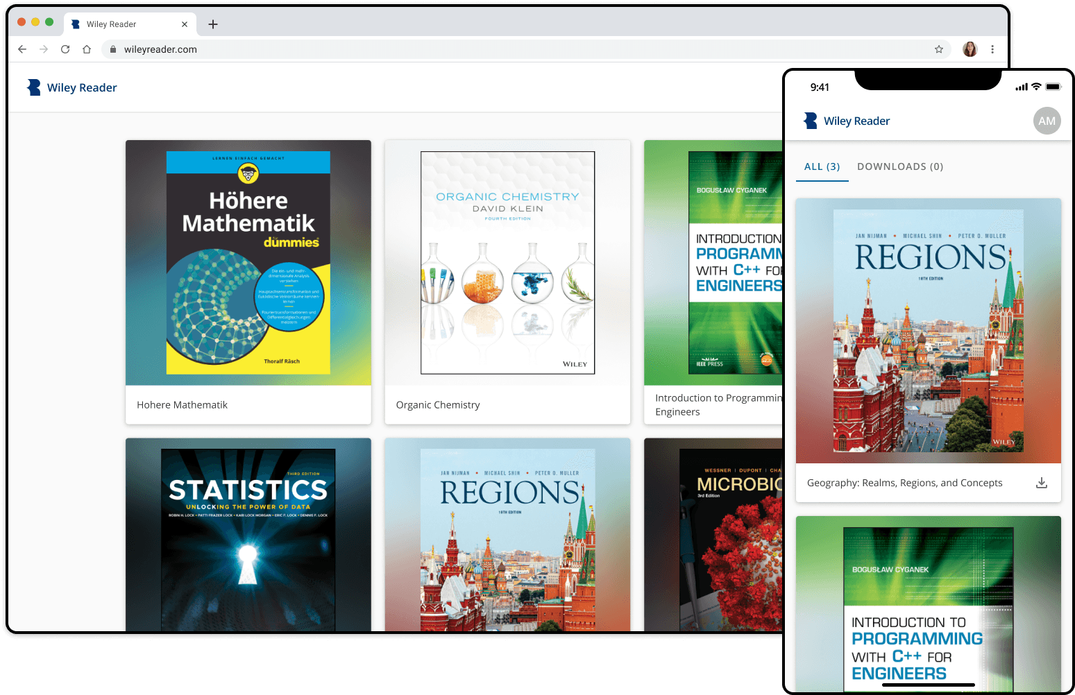
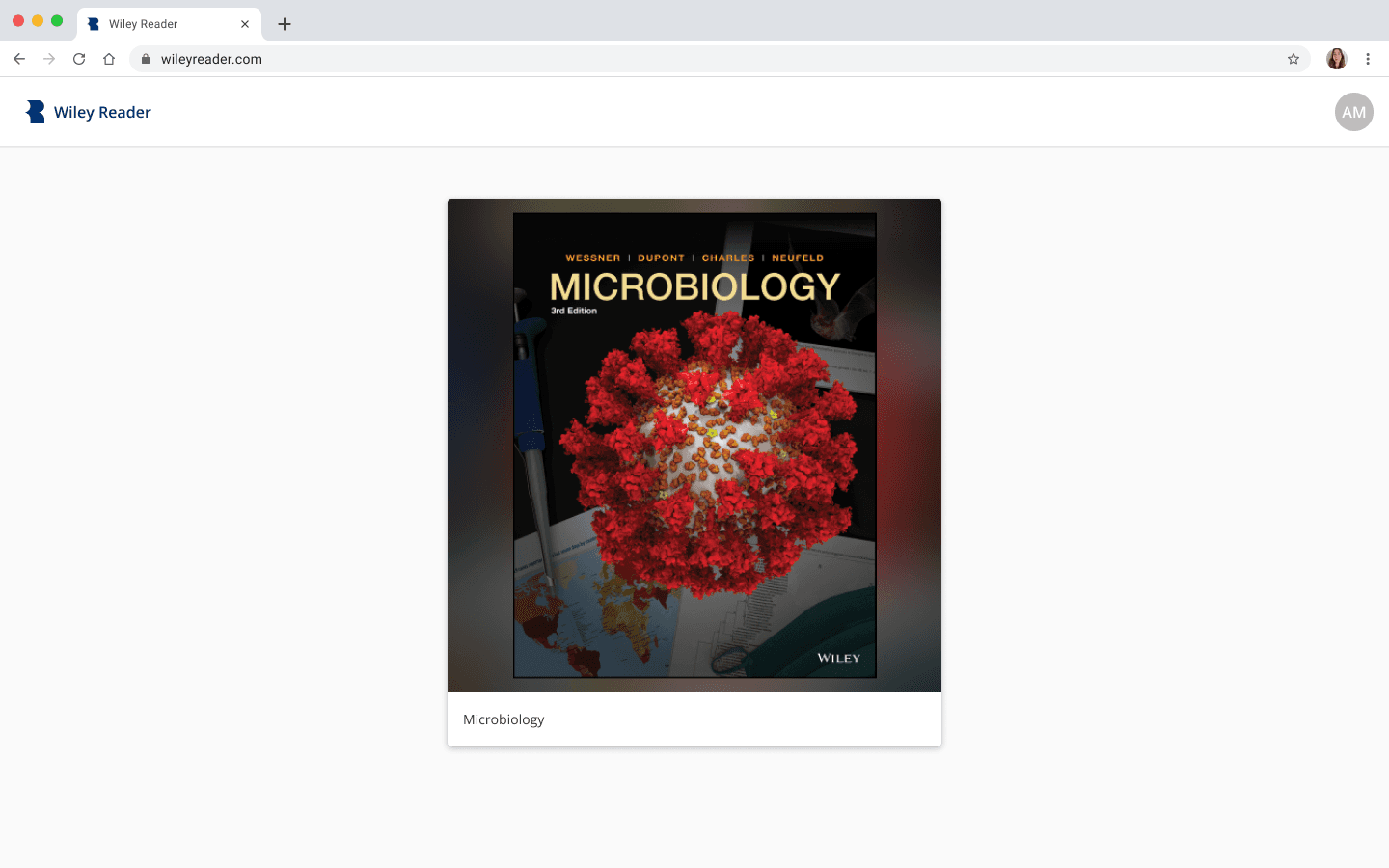
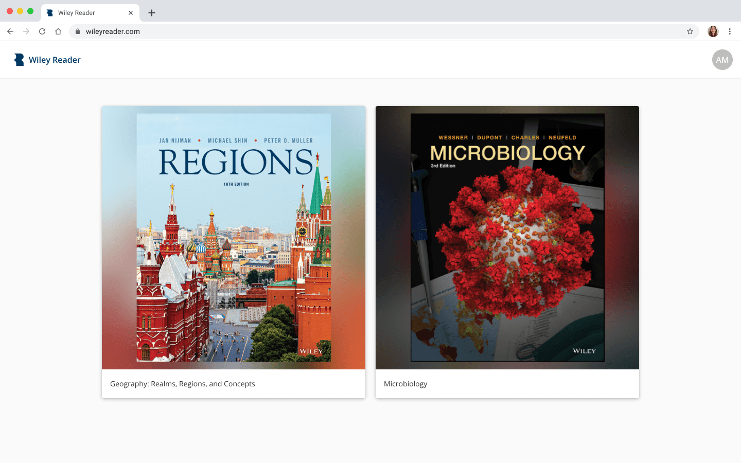
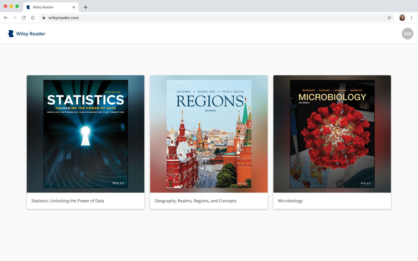
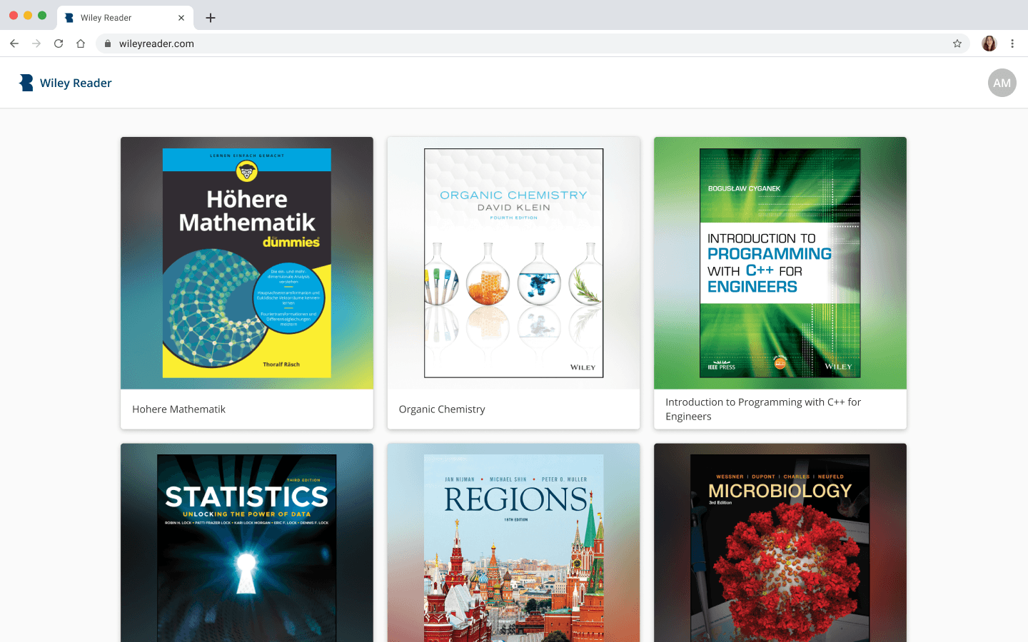
Bookshelf
The Wiley Reader is not a Kindle or a Nook. It is a space for students and professors to access online textbooks, which are most commonly rented out one to a few at a time. That being said, we optimized the bookshelf for less books, while also making room for exceptions.
1 book
2 books
3 books
4+ books
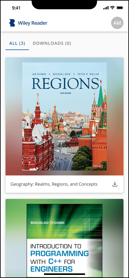
Mobile
Reader Application
In our web application, we wanted to keep the reading content the main focus while also making actions having to do with reading, like sifting through highlights and bookmarks, accessible and in a common area. We found the best way to do so was to construct a common menu on the left hand side of the screen, creating an abstract book binding.
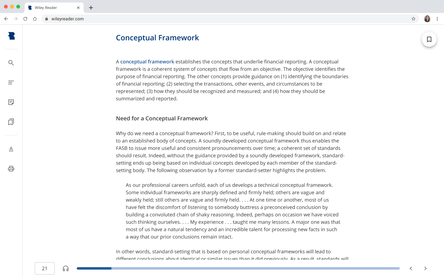
Desktop
We wanted to achieve the same goal in our mobile application, but had to use a slightly different strategy to accommodate for the limited real estate. To increase space for the main content, we made it so that learners would be able to view secondary functionality by tapping on the middle of the screen. We weren’t worried too much about discoverability as this was a common convention across other mobile reader applications.
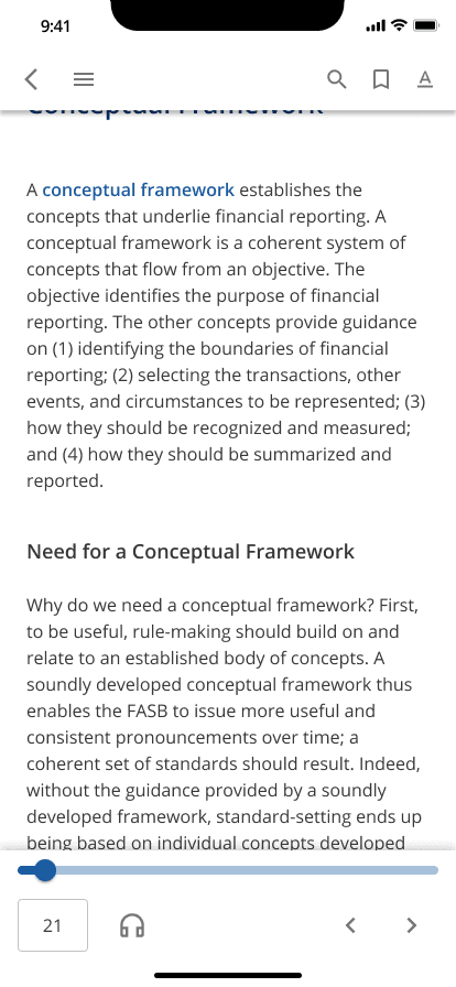
Mobile
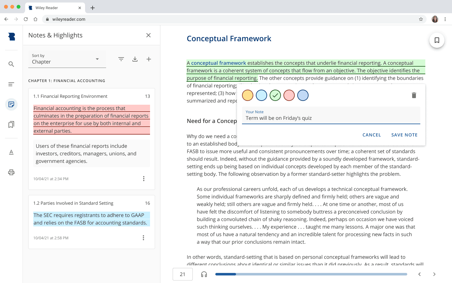
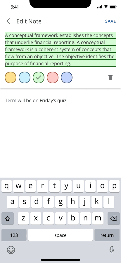
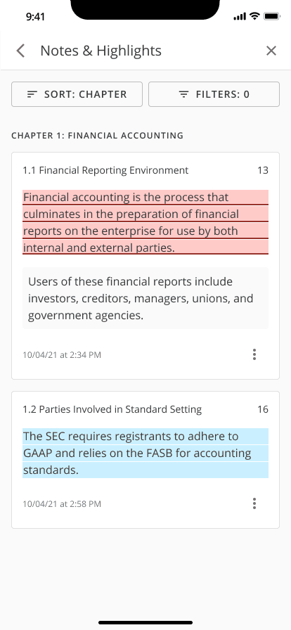
Notes & Highlights
Notes and highlights are constructed very similarly across reader applications, so we didn’t want to deviate too much from what we saw as a widely accepted pattern. What we did want to do was make highlighting fast enough to do in one tap or click and to make finding previous notes and highlights an easy experience. We made highlight swatches available to select directly upon dragging a cursor or finger across the text and we sorted notes and highlights in our Notes & Highlights drawer by chapter, which we found during beta testing to be a common way of searching for notes and highlights. We also added filtering by chapter to the drawer to make this common way of searching for notes and highlights even better.
Desktop
Mobile
A future consideration we have for this feature is to add a way to filter notes and highlights by color. We found that there are instructors and students who apply their own meanings to certain highlight colors and that this additional layer of filtering would be helpful to them. We also want to consider updating the way we symbolize notes. Due to development constraints, we could not place a note icon next to text associated with a note (as is done in so many reader applications). Instead, we symbolized notes as a highlight and an underline.
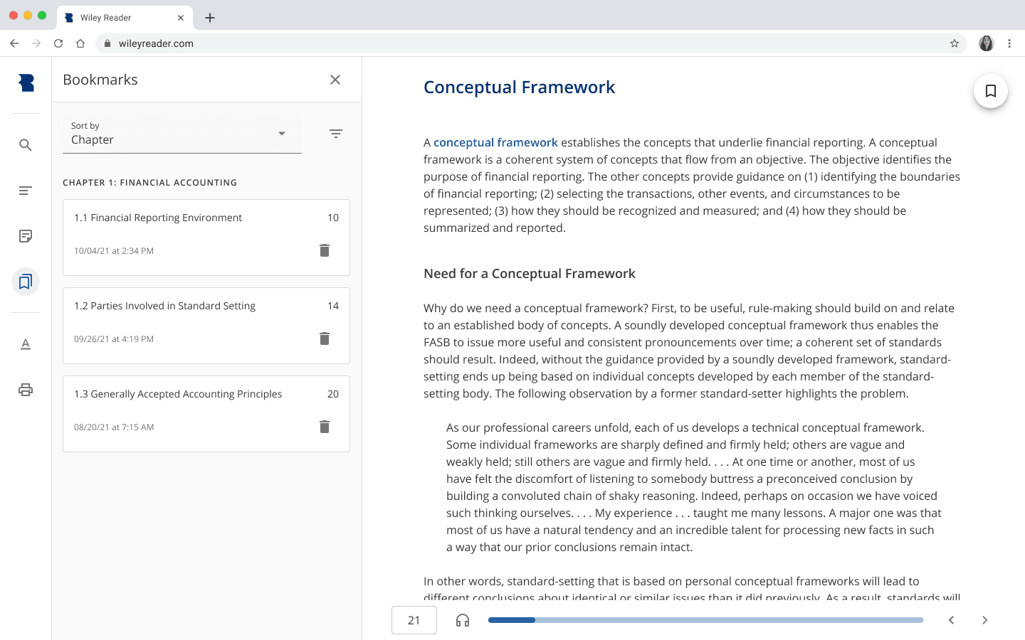
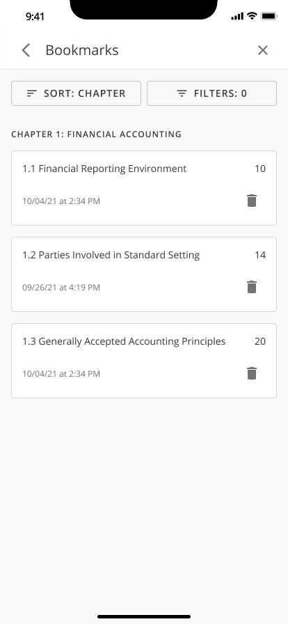
Bookmarks
Bookmarking is just as necessary in digital books as it is in physical ones. While it is a less granular way to mark important locations in a book than are notes and highlights, it still allows learners to remember their place down to the page number (I will talk a little more about the importance of the page number in the next section) and it resembles an action that learners take outside of the digital world.
In our desktop app, we wanted to stay true to the initial reason we created a left menu, so rather than placing bookmarking in a header, we incorporated it into a floating action button. This additionally allowed for bookmarking to be easily found no matter where a learner was on a page, something we found necessary to think about more when our beta testing feedback showed us learners were attempting to create bookmarks via their Bookmarks drawer after our first iteration of the bookmark. We also designed the Bookmarks drawer consistently with our Notes & Highlights drawer, as filtering by chapter was also important to learners for searching for previously made bookmarks.
Desktop
Mobile
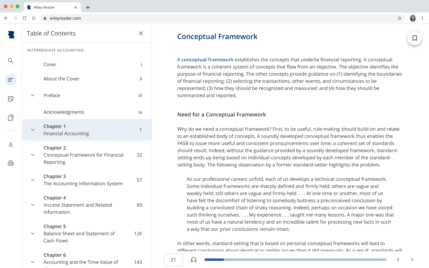
Table of Contents (TOC)
The TOC was an extremely important mode of navigation to build, especially in terms of learners completing reading assignments, studying for tests, and following along in class:
"Homework for this week is to read Chapter 3, Sections 1-3."
"The exam will be on all materials covered in Chapters 1 and 2."
"Follow along in the book on page 57."
That last example also shows why pages are still an important convention for digital textbooks. Though there is a lot of talk about getting rid of the page to adopt a more digital-centric approach to publishing, it is still part of the language used between students and instructors, so we made sure to include it in the TOC as well as other parts of the Reader.
Desktop
Mobile
A future consideration we have for the ToC is to work with our content team to move front matter— items like the Dedication or the Acknowledgements— to the bottom of the ToC even though they would be placed at the front of a print textbook. Typically, students don’t read those items and dive straight into the main content.
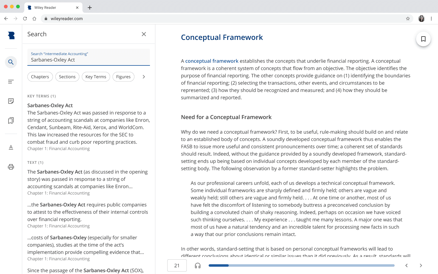
Search
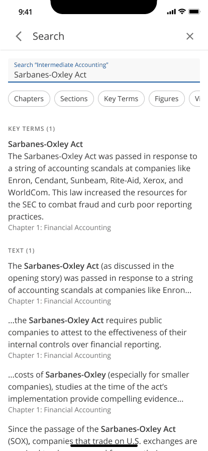
Though our findings have suggested that a good portion of students prefer to learn from print textbooks over digital textbooks (54.29% of our respondents to be exact), the ability to conduct a search query in a digital textbook makes looking for specific items so much easier than flipping through page after page in a print one. Items that we made available to search for were chapter and section titles, page numbers, key terms, figures, and tables. When none of those items can be found through a query, relevant text results from throughout the textbook are provided for the learner to select.
Desktop
Mobile
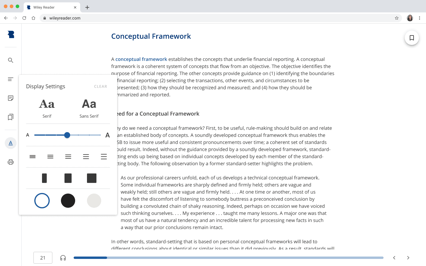
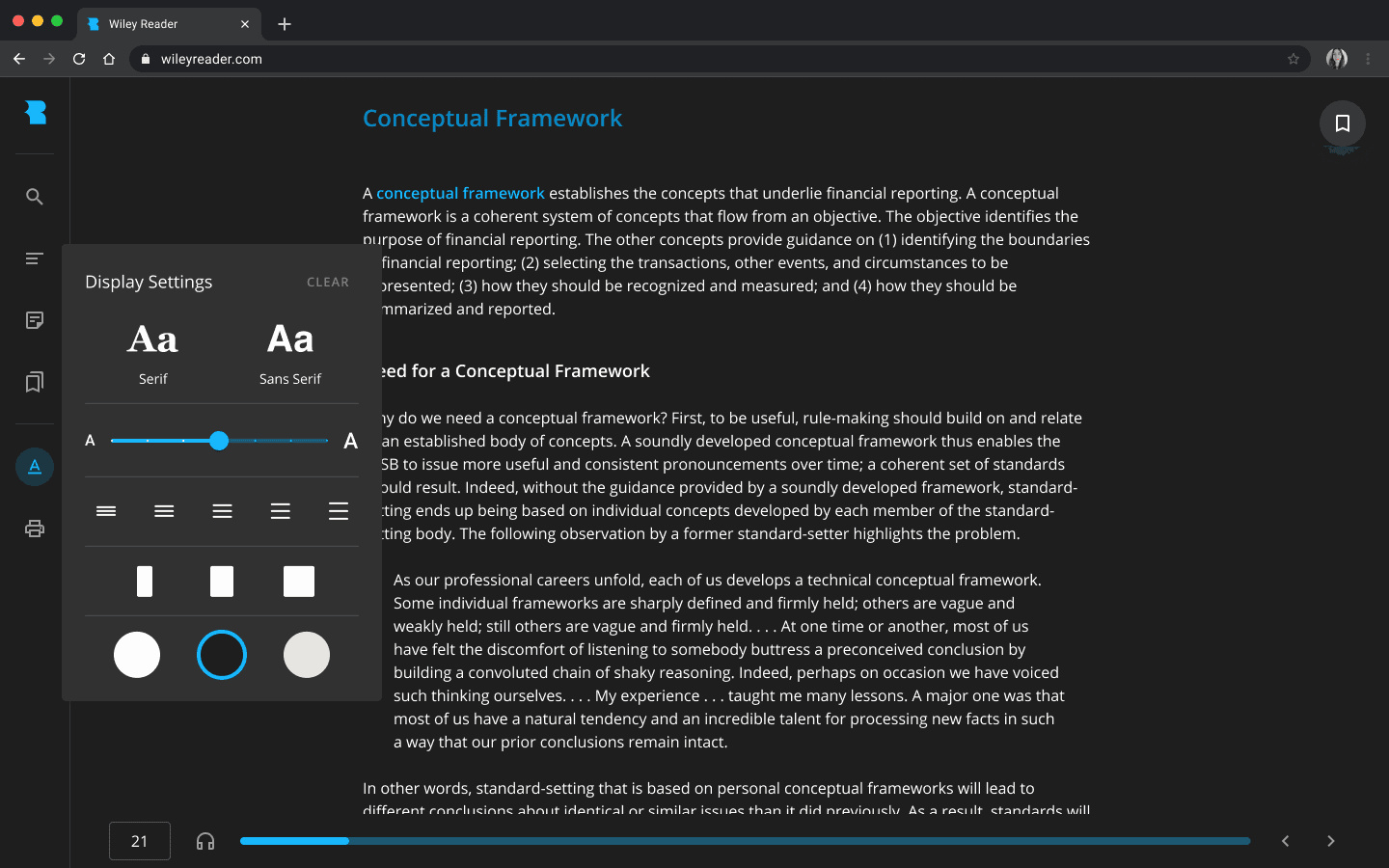
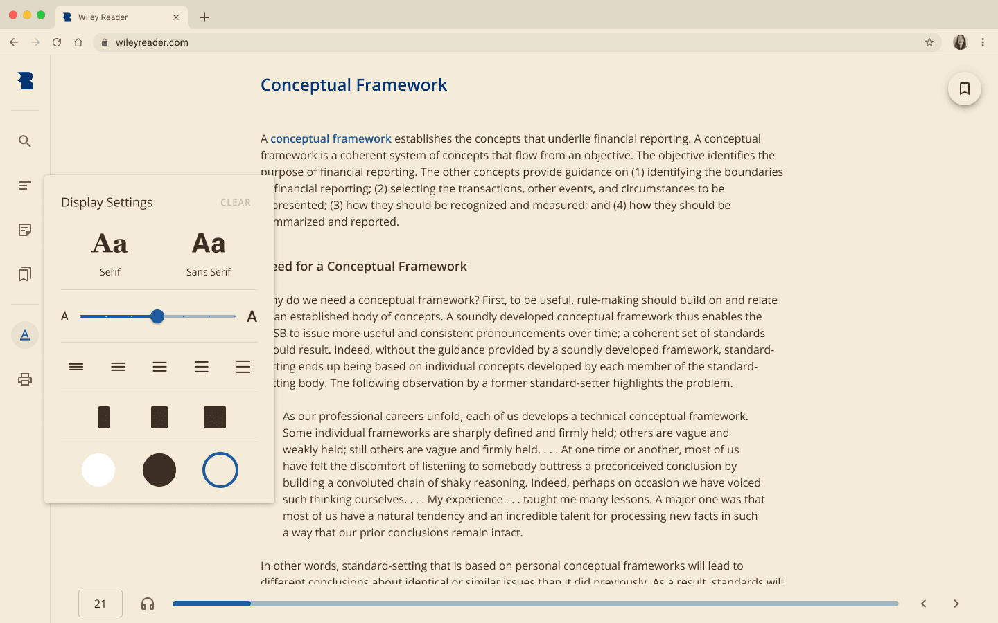
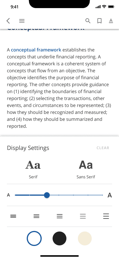
Display Settings
Users everywhere, including our learners, have preferences for how they like to read digital content, so we enabled multiple display settings which learners could personalize to their own tastes. We included settings like font type, text size, line height and content width to ensure readability was achievable in any textbook because there were no consistent guidelines for content creation on the authoring side. We also introduced three color modes— day mode, night mode, and sepia mode— which I also later worked to incorporate into our design system.
Fun fact: reading in sepia mode is actually proven to cause less visual eye fatigue than reading in day mode does, but surprisingly, the same cannot be said for reading in dark mode (although there are benefits to reading in dark mode over day mode at night).
Day Mode
Night Mode
Sepia Mode
Mobile
Something that we would also want to consider adding to our font type settings is a font that is more easily read by learners with dyslexia, such as the Dyslexie font.
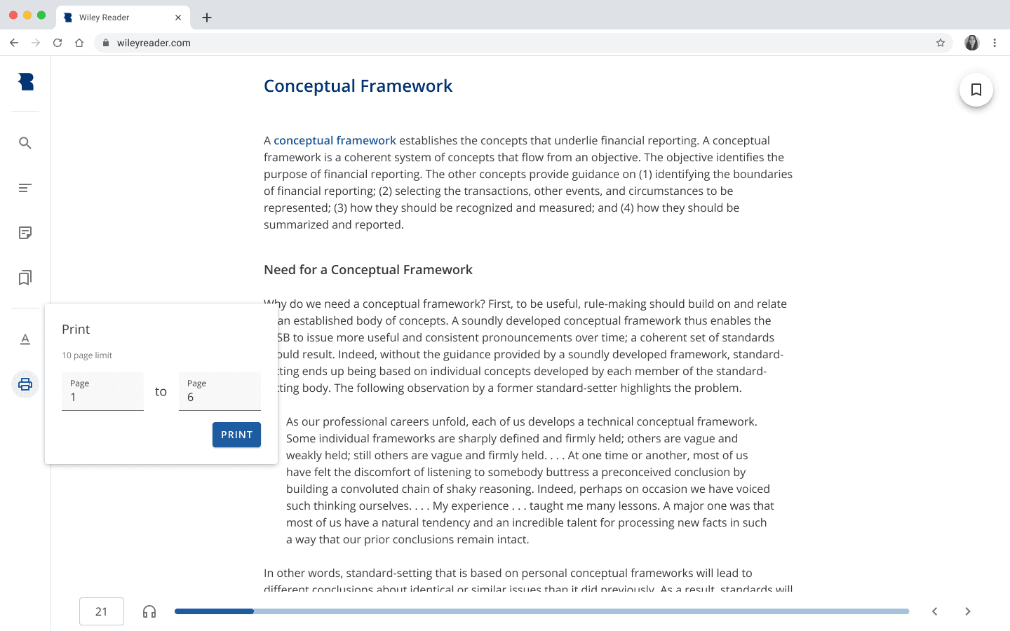
Printing
It might seem a little ironic to incorporate a printing feature into a digital textbook, but remember that sizable percentage of students (54.29%) who preferred reading print over reading digital content? The publishing industry may be marching toward a fully digital world, but it’s still important that we meet our learners halfway. In addition, we discovered that we had to meet a legal requirement of only allowing learners to print 10 pages at a time, so we wanted to set that expectation upfront to lessen confusion about printing.
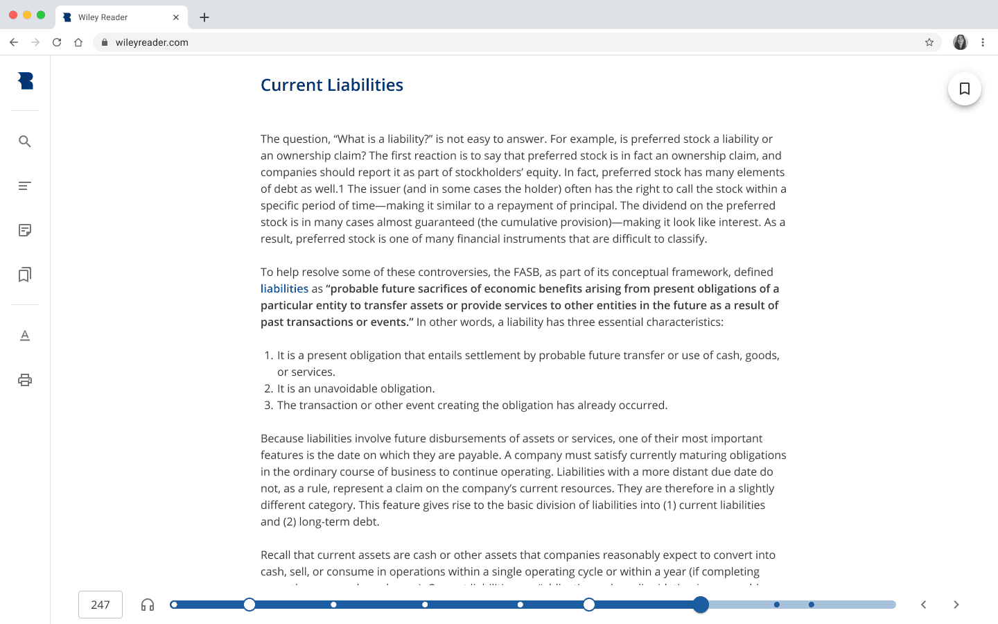
Progress Bar
Every reader application to date has a progress bar. Typically, the main purpose of this feature is to show readers how far along they are in an entire book. For our MVP version of the Wiley Reader, we followed the same principle, but not without reservations. Firstly, the types of books we host on our application are not novels, but textbooks where reading is completed by section or chapter instead of in a continuous manner. Secondly, it is an established pedagogical principle (the segmenting principle) that people “learn more deeply when content is broken into small chunks and [when they] can control the rate at which they access the chunks” (e-Learning and the Science of Instruction). Despite having these reservations, we agreed with product management that we would pursue a more segmented progress bar (perhaps one based on chapters or sections) at a later time to reduce development overhead and stay on our fast-tracked timeline.
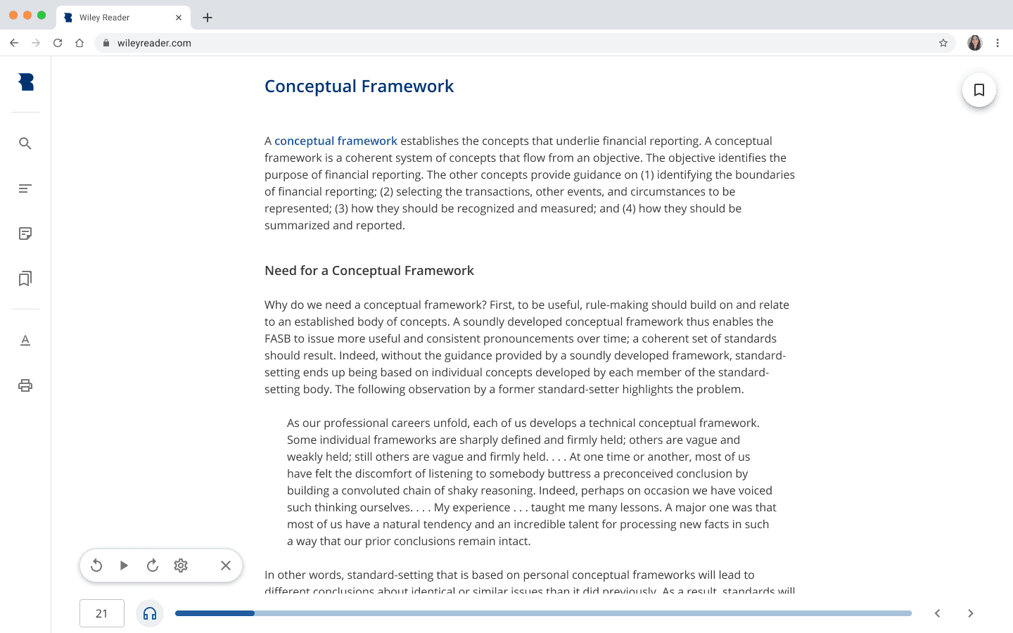
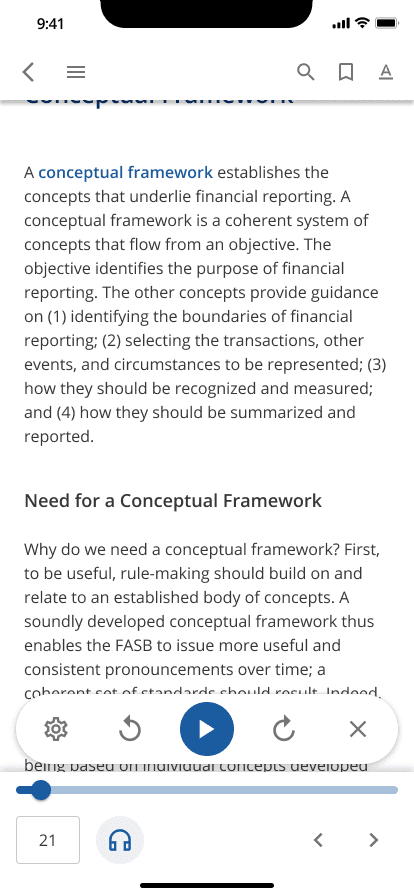
Read Aloud
The ability to have a textbook be read aloud by a computer is helpful to learners even if they don’t typically use something like a screen reader. Since the brain doesn’t process different sensory types in isolation, listening and reading at the same time can help learners retain information more effectively (or just help them out when they’re on the brink of falling asleep while studying 😉.)
We incorporated our read aloud feature into the progress bar as it is in its own way a mode of progress. Within the feature, we included speed settings to allow learners to adjust how fast they can process the content as well as voice settings taken from the learner’s browser.
Desktop
Mobile
© 2023 Alex Mircea, your friendly neighborhood UX wizard.